Itez news
Stay up to date with the latest stories and commentary brought to you by itez, a handy service for purchasing crypto.
Subscribe
 Best cold wallets of 2024
Read through it, and you'll discover what cold wallets are, their advantages, how to choose the perfect option for your needs, and which wallet can be deemed the best in 2024.
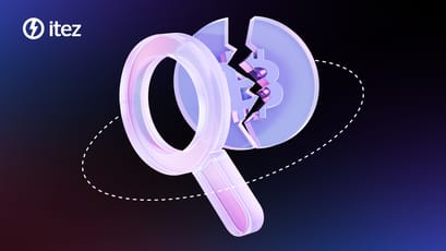
 The difference between coin and token: understanding crypto assets
Discover the key differences between coins and tokens in the cryptocurrency ecosystem. Learn about their features, roles, and examples in this comprehensive guide.
 What's interesting about NBX Warsaw 2024
Next Block Expo is a European blockchain festival, one of the largest European web3 events.
 Margin trading crypto: a comprehensive guide to leveraged trading
You've probably heard the term margin trading at least once in your life. We'd actually be surprised if you answered "no"! After all, this type of trading is one of the oldest and remains the most common one. Like all successful ventures, it evolved and kept up with the times to grow into what we're discussing today – cryptocurrency margin trading.
 12 facts you need to know about the Bitcoin halving 2024
Learn what crypto community members should know about Bitcoin halving 2024.
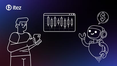 What is algo trading and how does it work? A comprehensive guide
In this piece, we'll delve into the intricacies of an innovative trading method called algorithmic trading, offering you insights into its workings.
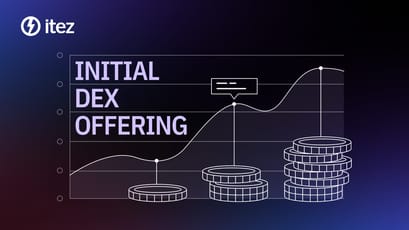 A comprehensive guide to IDO (Initial DEX Offering)
Learn everything you need to know about IDO (Initial DEX Offering) - what it is, how it works, its benefits, and how to participate in it.
 How high can Bitcoin climb with halving? Top price predictions review
We compiled Bitcoin forecasts from prominent participants in the crypto industry into a single review.
 Get to know the Global AI Show
Industry representatives will meet in Dubai to discuss everything about artificial intelligence.
 See you at the Global Blockchain Show
Experts from the web3 ecosystem will meet at the Global Blockchain Show to share ideas and discuss opportunities of this industry.


